
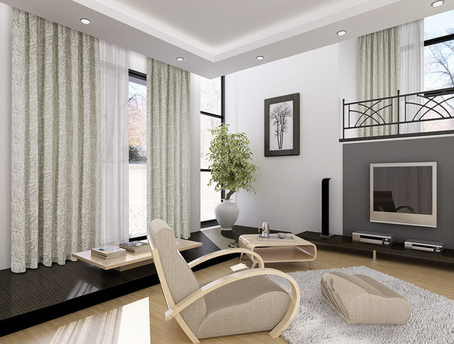

Curtains do far more than cover windows. They shape how a room feels, control lighting conditions, influence visual balance, and connect different design elements into a cohesive whole. When chosen thoughtfully, curtains help unify color palettes, textures, and proportions so a space feels calm, intentional, and complete.
Interior harmony depends on consistency and balance. The right curtain selection supports both. Whether designing a new room or refining an existing layout, understanding how curtains interact with lighting, architecture, and furniture can dramatically improve the final outcome.
Why Curtains Matter in Interior Harmony
Curtains occupy a large visual area, which makes them one of the most influential soft furnishings in any room. Because they sit at eye level and frame natural light sources, they naturally attract attention.
Well-selected curtains can:
- Balance strong architectural features
- Soften harsh lines in modern interiors
- Reinforce color continuity
- Improve light distribution
- Enhance privacy without closing off a space
- Support the mood of the room
Poorly chosen curtains, on the other hand, often disrupt otherwise thoughtful interiors by introducing mismatched tones or overwhelming textures.
Understanding the Role of Color in Curtain Selection
Color is one of the strongest contributors to interior harmony. Curtains should support the room’s palette rather than compete with it.
Matching Curtains with Wall Colors
For a calm and unified look:
- Choose curtains slightly lighter than wall color for softness
- Select a slightly darker shade for contrast without dominance
- Use neutral tones when the room already includes bold décor
This layered approach maintains visual continuity without flattening the design.
Coordinating with Furniture and Accessories
Curtains should relate to at least one other element in the room, such as:
- Upholstery
- Rugs
- Throw pillows
- Artwork accents
- Wood finishes
Repeating tones subtly across these elements creates cohesion.
Choosing the Right Fabric for Balance and Comfort
Fabric determines how curtains hang, filter light, and interact with surrounding materials. Each fabric contributes differently to harmony.
Lightweight Fabrics for Airy Interiors
Ideal for smaller rooms or bright environments:
- Cotton
- Linen
- Voile
- Sheer blends
These materials allow light to circulate while maintaining softness.
Medium-Weight Fabrics for Everyday Living Spaces
Balanced and versatile options include:
- Polyester blends
- Textured cotton
- Jacquard fabrics
They provide structure without heaviness.
Heavy Fabrics for Formal or Dramatic Spaces
Suitable for larger rooms or classic interiors:
- Velvet
- Brocade
- Thick woven textiles
These materials introduce depth and visual weight.
Selecting fabric weight according to room scale helps maintain proportion and harmony.
Curtain Length and Its Impact on Visual Flow
Curtain length strongly influences how spacious or structured a room feels. Proper length supports architectural rhythm.
Common curtain length choices include:
Floor-length curtains
These create elegance and visual continuity. They are ideal for living rooms and bedrooms.
Slightly pooled curtains
Best suited for traditional interiors where softness and luxury are desired.
Sill-length curtains
Appropriate for kitchens, reading corners, or areas with nearby furniture placement.
For harmony, curtains should align with the room’s architectural intent rather than interrupt it.
Choosing Curtain Styles That Support the Room Theme
Curtain styles should reflect the overall design language of the space.
Modern Interiors
Choose:
- Clean lines
- Neutral tones
- Minimal pleating
- Lightweight fabrics
This maintains clarity and openness.
Traditional Interiors
Select:
- Layered drapery
- Rich textures
- Decorative rods
- Classic folds
These reinforce warmth and refinement.
Transitional Interiors
Blend modern simplicity with traditional softness through:
- Structured linen curtains
- Subtle textures
- Neutral palettes with depth
Consistency across elements ensures stylistic harmony.
Using Curtains to Control Natural Light Effectively
Natural light shapes mood, color perception, and comfort levels within a room. Curtains allow flexible control over brightness throughout the day.
Consider these lighting goals:
Soft daylight diffusion
Use sheer curtains for gentle illumination.
Moderate light filtering
Layer sheers with medium-weight panels.
Complete light control
Choose blackout curtains for bedrooms or media rooms.
Balanced lighting prevents visual strain and improves overall atmosphere.
Layering Curtains for Depth and Flexibility
Layered curtains enhance both function and appearance. Combining sheer panels with heavier drapes creates dimension while offering adjustable light control.
Layering benefits include:
- Increased privacy options
- Enhanced insulation
- Greater visual richness
- Adaptability throughout the day
Layering also helps windows appear larger and more intentional within the room layout.
Selecting Curtain Hardware That Complements the Design
Curtain rods and accessories often go unnoticed until they clash with the room’s style. Choosing appropriate hardware strengthens visual continuity.
Consider these guidelines:
- Match rod finish with lighting fixtures
- Coordinate with furniture hardware tones
- Select understated brackets in minimalist interiors
- Use decorative finials in classic settings
Even subtle hardware choices contribute to harmony.
Patterned Curtains Versus Solid Curtains
Both patterned and solid curtains can support interior harmony when used thoughtfully.
When to Choose Solid Curtains
Solid curtains work best when:
- Walls already feature patterns
- Rugs are visually active
- Furniture textures vary significantly
They stabilize the room visually.
When to Choose Patterned Curtains
Patterned curtains are effective when:
- The room uses a neutral palette
- Accent repetition is needed
- Visual energy feels limited
Patterns should echo existing shapes or colors within the room.
Balanced repetition strengthens harmony rather than introducing distraction.
Considering Curtain Width for Proper Proportion
Curtains should never appear stretched or insufficiently full. Proper width ensures graceful folds and complete coverage.
Recommended fullness guidelines:
- Curtain width should be at least twice the window width
- Wider coverage improves softness
- Generous folds enhance elegance
Fullness contributes to comfort and visual completeness.
Matching Curtains with Flooring Materials
Flooring plays a strong role in visual grounding. Curtains should relate to it rather than contrast sharply without purpose.
Examples include:
- Warm-toned curtains with wood flooring
- Neutral curtains with stone or tile
- Soft textured curtains with carpeted rooms
These relationships strengthen spatial unity.
Coordinating Curtains Across Open Floor Plans
Open layouts require consistent visual transitions between zones. Curtains help maintain flow across connected spaces.
Strategies include:
- Using similar curtain fabrics in adjacent rooms
- Maintaining consistent curtain height
- Repeating neutral tones across zones
- Varying texture rather than color dramatically
This approach preserves continuity without repetition becoming monotonous.
Seasonal Curtain Adjustments for Comfort and Harmony
Curtains can adapt to seasonal needs without changing the entire interior.
Examples include:
- Lightweight linen panels for warmer months
- Heavier layered drapes for cooler seasons
- Neutral sheers year-round with interchangeable outer panels
Flexible curtain styling keeps interiors balanced throughout the year.
Avoiding Common Curtain Selection Mistakes
Even carefully designed interiors can lose harmony through avoidable curtain errors.
Common mistakes include:
- Hanging curtains too low
- Choosing overly short panels
- Ignoring wall color relationships
- Selecting fabrics too heavy for small rooms
- Mixing incompatible hardware finishes
Correct placement and coordination maintain visual consistency.
Creating a Cohesive Look with Curtain Accessories
Accessories reinforce harmony when used with restraint.
Useful additions include:
- Tiebacks that match accent colors
- Subtle trims echoing upholstery details
- Neutral curtain rings coordinating with rods
Small details often strengthen overall unity more than major changes.
FAQ: Choosing the Right Curtains for Interior Harmony
1. Should curtains always match the sofa color exactly
Curtains do not need to match exactly. Coordinating tones within the same palette usually creates a more refined and balanced look.
2. Are ceiling-mounted curtains better than wall-mounted options
Ceiling-mounted curtains can make rooms appear taller and more spacious, especially in apartments with lower ceiling heights.
3. Can dark curtains work in small rooms
Yes, dark curtains can work well when balanced with lighter walls and adequate natural light.
4. Is it necessary to use curtain liners
Curtain liners improve durability, enhance insulation, and help maintain fabric color over time.
5. How many curtain layers are ideal for most living rooms
Two layers typically provide the best flexibility for light control and privacy.
6. Should curtain rods extend beyond the window frame
Extending rods beyond the window frame allows more light to enter and creates a wider visual appearance.
7. Do patterned curtains make a room feel smaller
Not necessarily. When patterns are scaled appropriately and coordinated with other elements, they can enhance depth rather than reduce perceived space.
Thoughtful curtain selection transforms interiors into balanced and comfortable environments that feel intentional and visually connected throughout the home. 😊🏡
