

Color plays a powerful role in how a kitchen feels and functions. Beyond aesthetics, the right color scheme can influence appetite, energy levels, comfort, and even social interaction. Since kitchens are often the heart of the home, selecting colors that support both emotional well-being and daily activity is essential.
A thoughtful kitchen palette does more than look attractive. It helps create a welcoming environment where cooking feels enjoyable, meals feel satisfying, and time spent together becomes more meaningful. This guide explores practical and effective kitchen color schemes that support appetite stimulation while enhancing mood and comfort.
Why Kitchen Colors Influence Appetite and Mood
Color psychology affects how people perceive space and experience food environments. Warm tones tend to stimulate hunger and conversation, while cooler tones encourage calmness and clarity.
In kitchen design, color choices can:
- Increase or reduce appetite perception
- Influence energy and alertness
- Improve visual warmth and comfort
- Support relaxation during meals
- Enhance natural lighting conditions
Selecting the right balance ensures the kitchen supports both productivity and enjoyment.
Warm Colors That Naturally Stimulate Appetite
Warm hues are widely recognized for encouraging social interaction and enhancing hunger signals. These tones work especially well in family kitchens and dining-focused layouts.
Red for Energy and Engagement
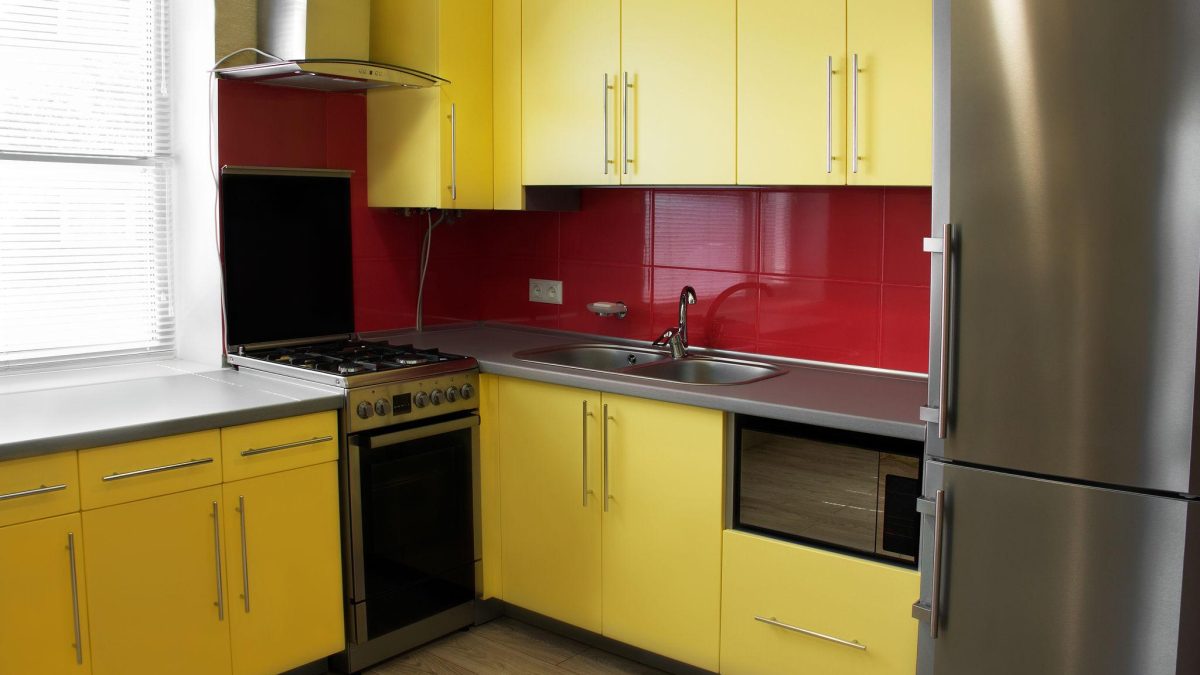
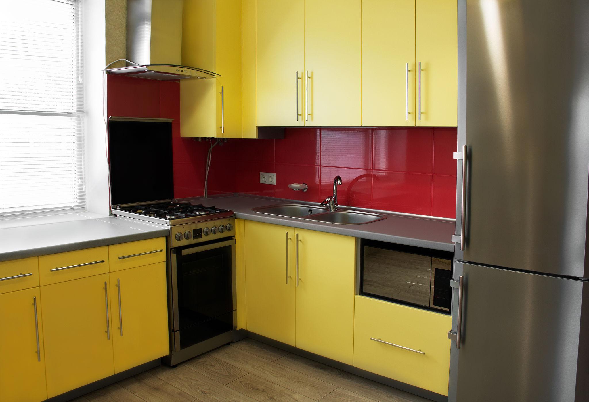
Red is one of the most appetite-stimulating colors used in kitchen design. It creates warmth, excitement, and visual focus.
Effective ways to incorporate red include:
- Accent backsplashes
- Lower cabinet finishes
- Bar stool upholstery
- Statement wall sections
Because red is visually strong, it works best when balanced with neutral surfaces.
Orange for Comfort and Conversation
Orange combines the energy of red with the brightness of yellow, making it ideal for encouraging relaxed social interaction.
Best uses for orange include:
- Breakfast nook seating
- Decorative accessories
- Feature walls
- Open shelving back panels
Soft terracotta tones provide a more sophisticated alternative to brighter oranges.
Yellow for Warmth and Positivity
Yellow reflects light beautifully and creates a cheerful atmosphere that naturally supports appetite and morning energy.
Popular yellow applications include:
- Cabinet fronts
- Wall paint
- Window treatments
- Decorative storage containers
Muted buttery yellows feel timeless and welcoming without overwhelming the space.
Neutral Color Schemes That Support Emotional Balance
Neutral palettes help stabilize visually active kitchens while maintaining warmth and flexibility.
Warm White for Brightness and Freshness
Warm white kitchens feel clean yet inviting. This color enhances natural light and allows accent tones to stand out.
Advantages of warm white include:
- Expands visual space
- Improvers brightness levels
- Supports layered textures
- Matches most materials easily
Warm white cabinets paired with wood surfaces create especially harmonious environments.
Beige and Soft Taupe for Comfort
Beige and taupe tones create grounding warmth without distracting attention from food presentation.
These shades work well for:
- Wall finishes
- Cabinet colors
- Stone countertops
- Flooring transitions
Their subtlety supports long-term design flexibility.
Earth-Inspired Greens That Encourage Relaxation and Freshness
Green is strongly associated with freshness and natural ingredients. It promotes calmness while maintaining visual vitality.
Sage Green for Modern Warmth
Sage green is one of the most versatile kitchen colors available today. It balances softness with sophistication.
Best placements include:
- Cabinet finishes
- Island bases
- Pantry doors
- Decorative tiles
Sage pairs beautifully with brushed brass hardware and wood textures.
Olive Green for Depth and Appetite Support
Olive green introduces richness without becoming overpowering. It works especially well in kitchens that emphasize natural materials.
Effective combinations include:
- Olive cabinets with marble countertops
- Olive islands with light perimeter cabinets
- Olive accent walls with neutral flooring
This tone supports both appetite and relaxation simultaneously.
Blue Tones That Promote Calm Cooking Environments
Blue is often associated with tranquility. While some cooler blues may reduce appetite slightly, carefully selected warmer blues support emotional comfort without suppressing hunger.
Soft Blue for Airy Kitchens
Soft blue tones work especially well in kitchens with strong daylight exposure.
Common uses include:
- Upper cabinets
- Wall paint
- Tile backsplashes
- Open shelving accents
These tones create visual clarity without overwhelming the space.
Navy Blue for Sophisticated Warmth
Navy adds depth and elegance while maintaining balance when paired with lighter elements.
Strong combinations include:
- Navy lower cabinets with white uppers
- Navy kitchen islands with wood countertops
- Navy walls with brass lighting fixtures
This creates visual contrast while maintaining harmony.
Natural Wood Tones That Enhance Appetite Comfort
Wood finishes create warmth that supports relaxation and encourages longer dining experiences. Natural textures help kitchens feel welcoming rather than purely functional.
Popular wood applications include:
- Cabinet faces
- Floating shelves
- Ceiling beams
- Flooring surfaces
Wood tones pair effectively with nearly every color palette and enhance overall harmony.
Two-Tone Kitchen Color Schemes for Visual Balance
Two-tone kitchens create depth without visual clutter. They also allow designers to combine appetite-stimulating tones with calming neutrals.
Successful combinations include:
- White upper cabinets with warm wood lowers
- Sage cabinets with cream walls
- Navy islands with soft gray perimeter cabinetry
- Beige walls with terracotta accents
Two-tone layouts help prevent color fatigue in frequently used kitchens.
Accent Colors That Strengthen Mood Without Overpowering
Accent colors provide personality while maintaining balance across the overall palette.
Effective accent choices include:
- Copper finishes
- Matte black hardware
- Brass lighting fixtures
- Patterned tile inserts
- Upholstered seating colors
Using accents strategically prevents visual overload while strengthening character.
Choosing Kitchen Colors Based on Lighting Conditions
Lighting significantly affects how colors appear throughout the day. Selecting shades that respond well to natural and artificial light ensures consistent visual comfort.
Consider these guidelines:
Bright kitchens with large windows
Support deeper tones such as navy, olive, or terracotta.
Moderate daylight kitchens
Benefit from warm neutrals and muted greens.
Low-light kitchens
Work best with warm whites and soft yellows.
Matching colors with lighting conditions prevents dull or overly harsh visual effects.
Matching Kitchen Colors with Cabinet Materials
Cabinet materials influence how color appears and performs over time.
Helpful pairings include:
- Painted cabinets with matte finishes for softness
- Natural wood cabinets for warmth
- Laminate finishes for durability
- Stone countertops for balance
Combining materials thoughtfully strengthens harmony across the space.
Creating a Mood-Boosting Kitchen Through Color Layering
Layering multiple compatible tones creates a more engaging environment than relying on a single dominant shade.
Effective layering includes:
- Neutral base cabinets
- Colored island accents
- Textured backsplashes
- Coordinated seating fabrics
This layered strategy ensures the kitchen feels dynamic yet balanced.
Seasonal Flexibility in Kitchen Color Styling
Small adjustments can refresh kitchen mood throughout the year without major renovation.
Seasonal updates may include:
- Changing countertop accessories
- Rotating textiles
- Updating chair cushions
- Introducing seasonal produce displays
These subtle changes maintain freshness while preserving the main color scheme.
Avoiding Common Kitchen Color Selection Mistakes
Even attractive colors can reduce comfort if used incorrectly.
Common mistakes include:
- Choosing overly dark palettes in small kitchens
- Ignoring lighting direction
- Mixing too many bold tones
- Selecting high-gloss finishes excessively
- Forgetting visual connection with adjacent rooms
Balanced planning prevents these issues.
Coordinating Kitchen Colors with Dining Areas
Many modern homes connect kitchens with dining spaces. Maintaining visual continuity between these areas improves harmony.
Helpful coordination strategies include:
- Repeating accent colors
- Matching lighting finishes
- Aligning wood tones
- Using complementary wall shades
These connections make transitions feel natural and intentional.
FAQ: Kitchen Color Schemes That Boost Appetite and Mood
1. Which kitchen color works best for families who cook daily
Warm neutrals combined with soft greens often provide the most comfortable environment for frequent cooking and shared meals.
2. Can glossy cabinet colors affect mood differently than matte finishes
Yes, glossy finishes reflect more light and create energy, while matte finishes feel calmer and more grounded.
3. Are darker kitchen islands practical for busy households
Darker islands can hide wear better than lighter finishes and add visual structure to open kitchens.
4. How do countertop colors influence appetite perception
Warm-toned countertops such as beige stone or wood textures tend to support appetite more effectively than stark cool surfaces.
5. Should ceiling color match kitchen walls
Ceilings usually work best in lighter tones to maintain openness and prevent visual heaviness.
6. Can backsplash color change the emotional feel of a kitchen
Yes, backsplashes introduce strong visual accents that can shift the mood from energetic to calming depending on the shade selected.
7. Is it better to choose timeless kitchen colors or follow current trends
Timeless base colors combined with trend-driven accents provide long-term flexibility while keeping the kitchen visually current.
